Hot Sauce Labels: First Impressions Rule
Client Deadly Dan Sauces
Role Creative Director, Lead Designer
Applications Illustrator, Photoshop, Creative Cloud, Procreate
Skills Packaging Design, Typography, Illustration, Colour Theory, Copywriting
Deadly Dan wanted to create a label like no other. With so much competition in the hot sauce industry from local producers to the big brands we needed to come up with a design that would entice people to grab the Deadly Dan Sauce bottle off the shelf over everyone else.
Deliverables
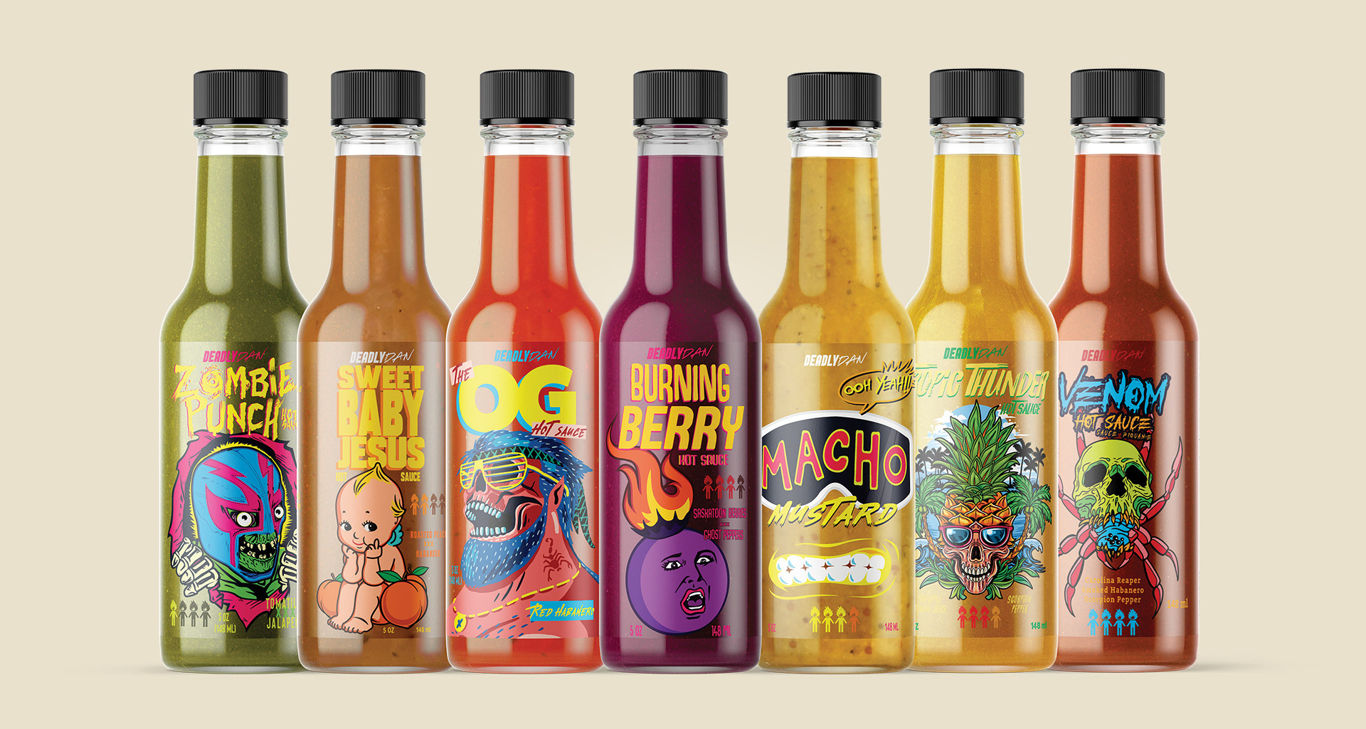
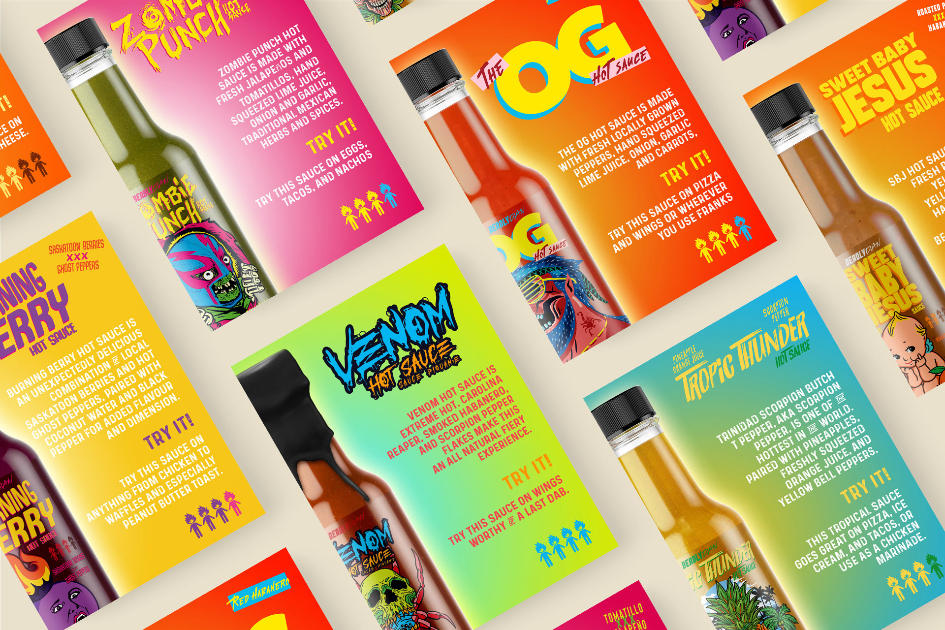
The bespoke label designs brought personality to each sauce flavour and character to the brand. OG specifically stole the show and became the mascot of the company. With the use of bright colours to pop off the shelves, nostalgic skater-style illustrations to connect with their key GenX/GenZ demographic, and a clear label to show off the colourful sauces as much as possible…our zig, when everyone else was zagging. The launch of the sauce lineup was a huge success and everyone that came across it wanted to join the party—within the first couple of months, retailers across Saskatchewan and Canada excitedly picked up the sauce to carry on their shelves in massive part due to the fun label design.
Label Design
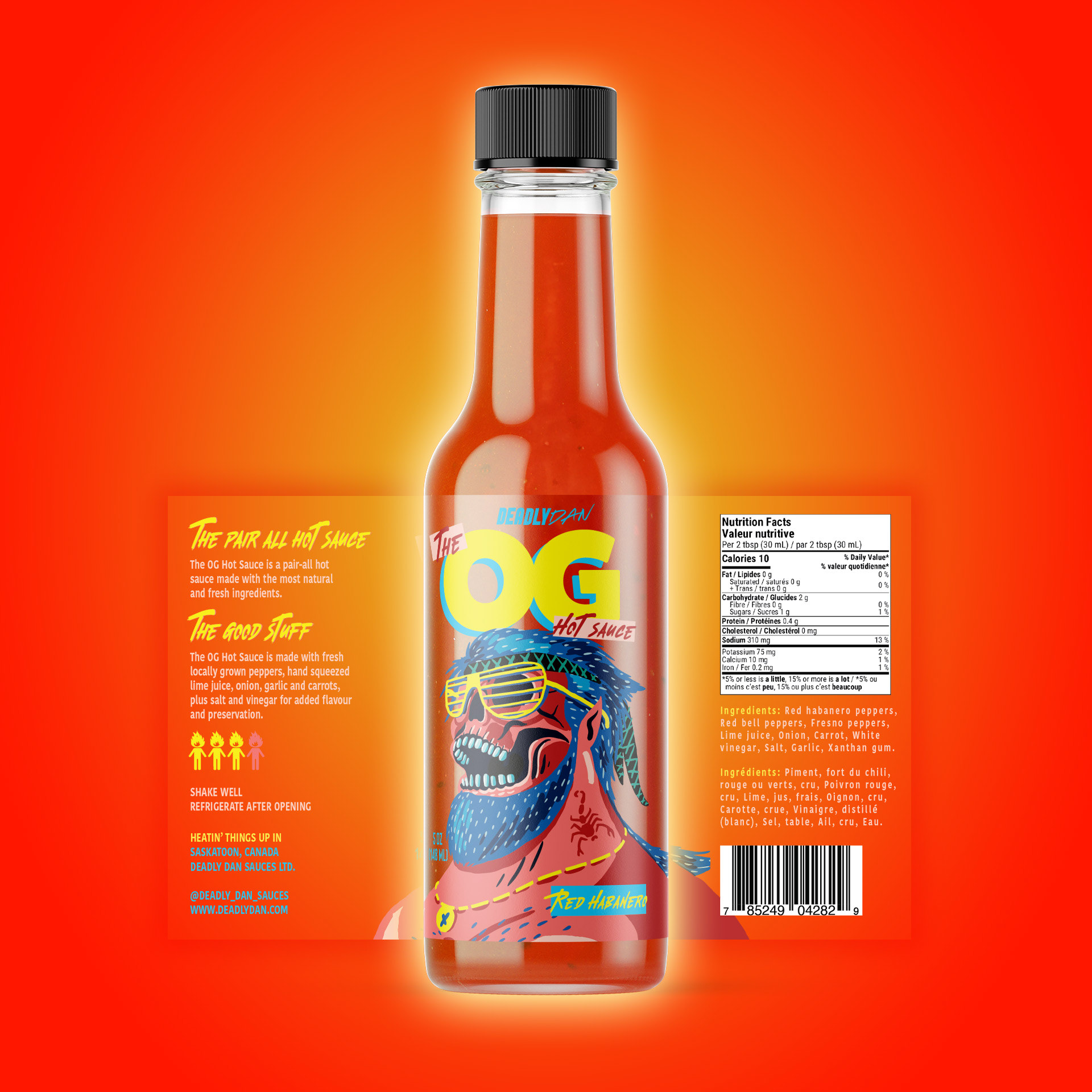
One of my favourite things to do with design is to zig when everyone else zags.
The majority of hot sauce labels are designed on opaque labels which hide all the good stuff inside. Deadly Dan's sauces are so vibrant and colourful that we wanted to show them off as much as we could. We understood that the cost of clear labels is higher than solid but to stand out from the crowd in a first impression there was no other choice.
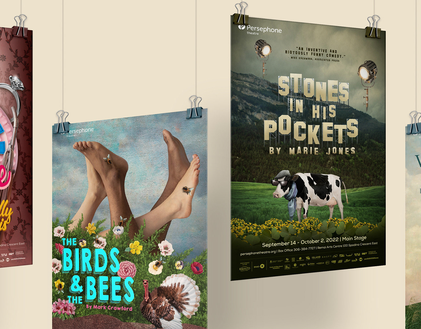
Posters

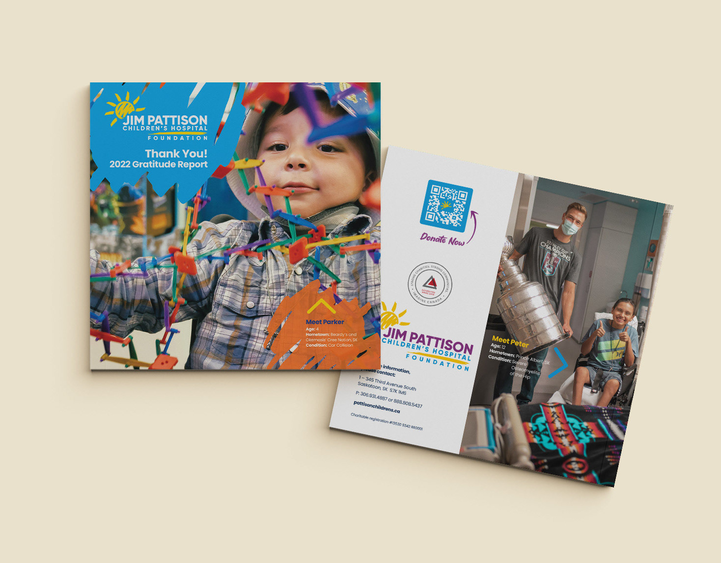
Thank You!
Let's Work Together